A shared, living inventory — formal and informal side by side.
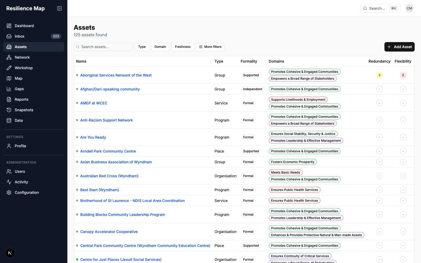
Why it's built this way: the research found Wyndham's most effective assets are informal — and least visible to institutional planning. The register holds community-led groups alongside funded services, with verification workflows because staff trust in data was the recurring condition for use.
The connections are the infrastructure.
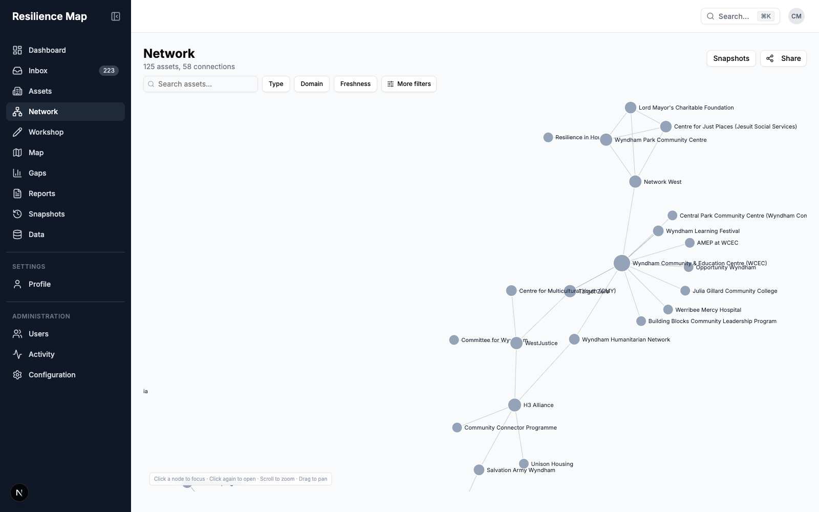
Why it's built this way: the ABCD relational lens, made operational. In one workshop, a community group filled a whiteboard with sixty organisations they could name — then realised how few they could actually call on under pressure. The network view maps exactly that: where connection is deep, and where it is only awareness.
Built in the room, with the people who hold the knowledge.
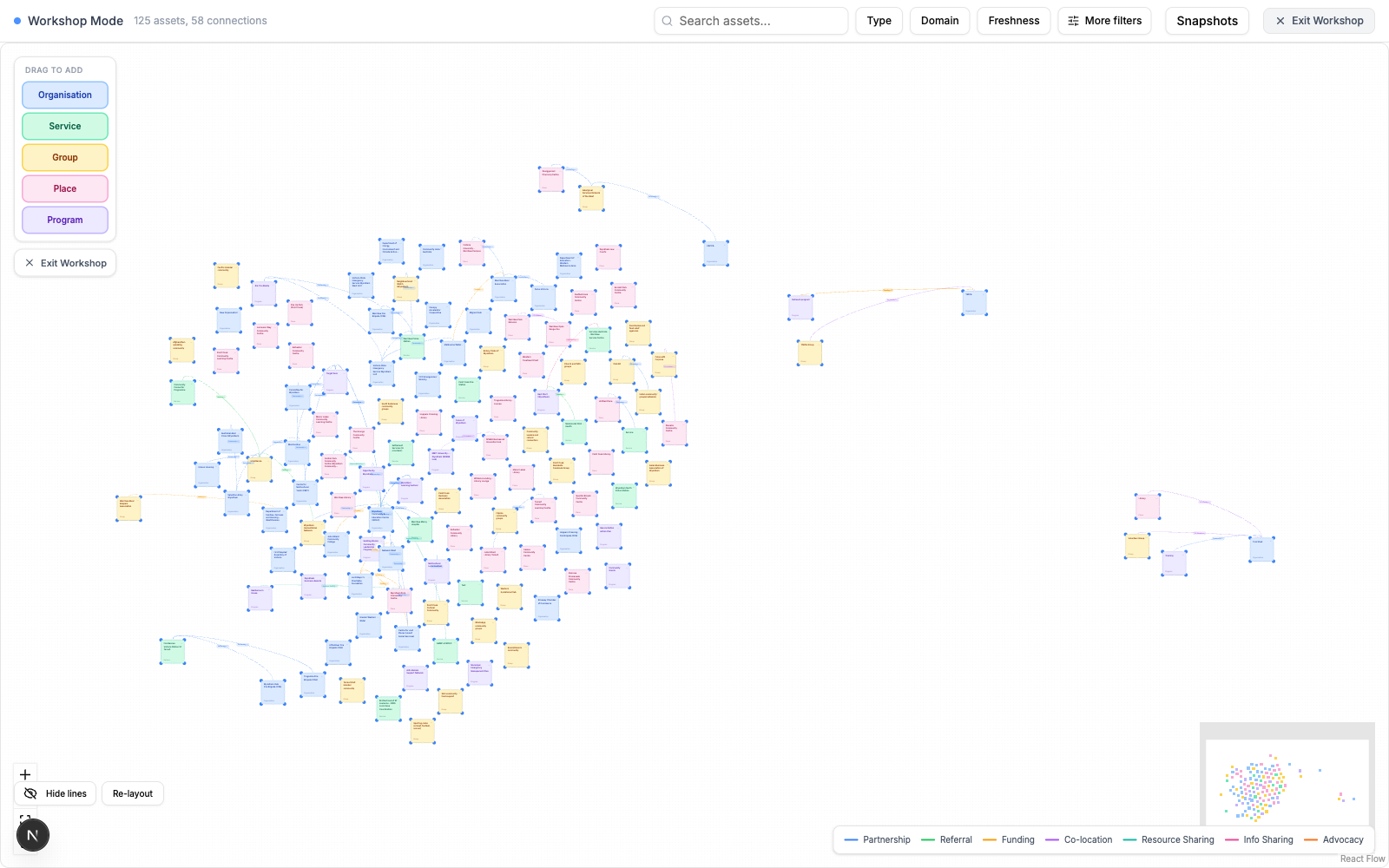
Why it's built this way: the research showed information alone doesn't shift capacity — relationships and experience do. Letters about fire preparation went unread for years; doorstep conversations and staged mock emergencies changed behaviour. Workshop mode turns the whiteboard exercise into shared, durable infrastructure: the map improves and the relationships deepen in the same session.
See what's missing before a shock finds it.
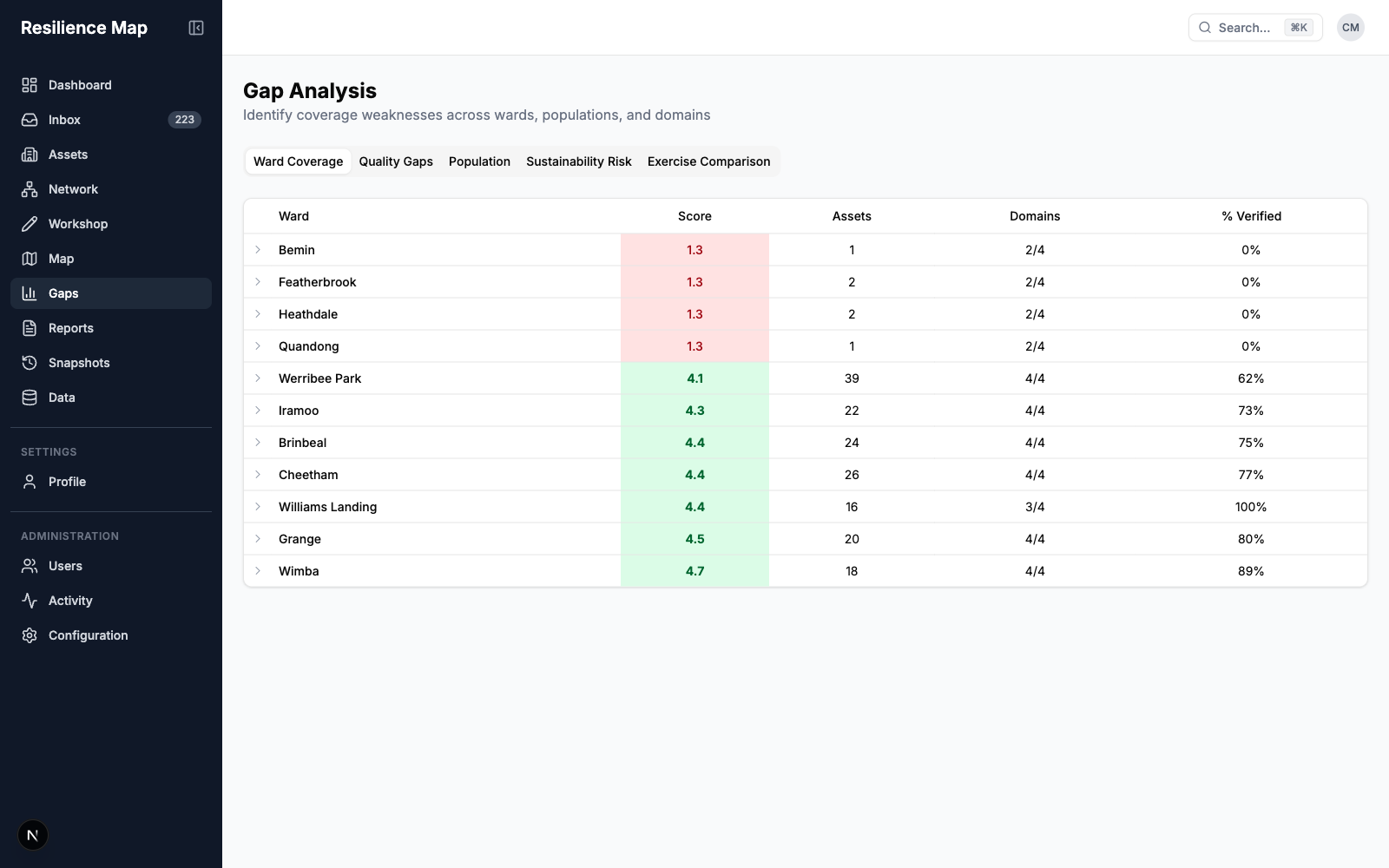
Why it's built this way: barriers in Wyndham compound — transport, language, housing and awareness reinforce each other, and growth-area communities are "literally popping up alongside paddocks." Meanwhile the formal vulnerable persons register captures 20–30 people in a municipality of 360,000+. Gap analysis makes the space between formal visibility and actual vulnerability something council can act on — and natural-language search answers the questions no dashboard anticipated.